Part 3: Aggregated supply and demand across multiple households
One of the main problems with looking at demand at the single household level is that demand at this level is very spiky, there are often long periods of low use around 100W and then suddenly a kettle or electric car charger turns on and demand increases by 20-30x in an instant. Solar generation can be very spiky too and so there is room for matching but it can be difficult to get the timing right.
One solution to increasing supply & demand matching at the household level is to have in home battery storage and diversion to hot water stores – but it may not be the best solution for all cases.
Aggregating supply and demand across households provides an example of how the degree of matching can be increased significantly by what could be described as sequential demand. Not everyone boils a kettle at the same time or a cloud passing over one households solar pv system may not be passing over another’s.
In order to explore the extent of increased matching possible through aggregation of supply and demand I have been working with Dominic McCann from Carbon Coop on what could be called a ‘virtual microgrid’ concept, we have a provisional front page for this here - please note that its still in early development:
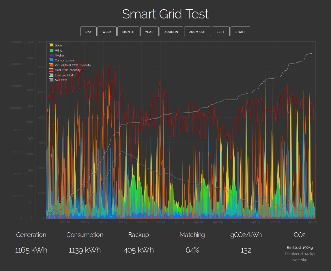
With only four households aggregating on-site solar, off-site wind, hydro and consumption and with total supply matching total demand over the whole period achieved by scaling the wind component, we can see matching increasing from 46% in the previous example to around 64% here. The resulting average carbon intensity is 132gCO2/kWh.
At this carbon intensity a heatpump (@ COP 3.0) has a delivered heat carbon intensity of 44gCO2/kWh, 81% less than gas and an EV (@ 3.7 miles/kWh) has a carbon intensity of 22gCO2/km 80% less than a very efficient petrol car doing 60 real world mpg, this compares with a carbon saving of roughly 45% vs direct gas heating and a petrol car if the electricity supply was from a grid supply consisting of gas, coal and nuclear at present UK proportions. Its a bit more complicated than this as more of the co2 was emitted when the EV was charging than at other times, the overall carbon intensity is just an average, Il come back to a more in-depth analysis of this again.
The result goes some way to illustrating why a mixture of renewable generation sources and aggregated demand ultimately increases the usefulness of the renewable supply and reflects the kind of results we see from running hourly zero carbon energy system models such as the one developed by the Center for Alternative Technology. These indicate that matching levels of between 62% and 78% are possible before storage and significant demand shifting with normal electric demand, heatpump heating demand and EV charging demand. See modelled supply/demand matching based on ZeroCarbonBritain data:
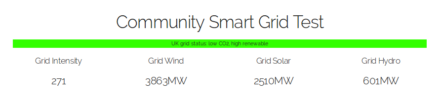
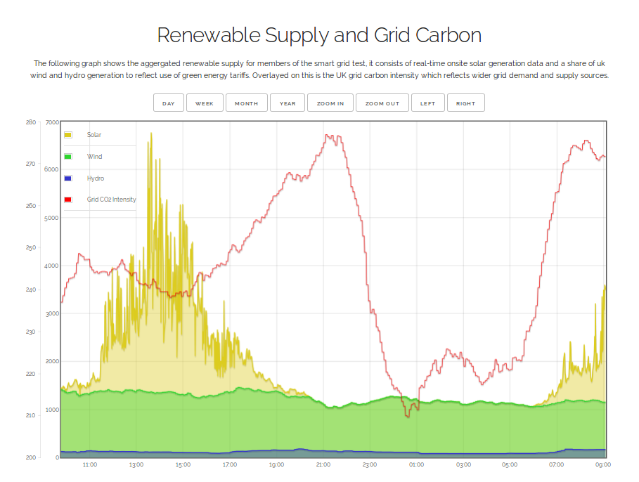
Visible currently on the community smart grid test front page is the participating households renewable supply mix, real-time information on grid CO2 intensity and grid wind, solar and hydro. Household demand is not currently shown as there are not enough participants for the demand profile to be sufficiently anonymous.
At the top of the page is a UK grid status indicator that is based on Dominic McCann’s work explained in more detail in Dominic’s blog post.