What kind of information can we extract from power measurements?
The most direct representation of power data is power over time which is what we get if we simply log the power values transmitted from a monitor. With this we can see what our power consumption or power generation looks like throughout a day, you can see the relative magnitude of different loads, identify visually different appliances from kettle's to LED light bulbs.
 |
| The power vs time visualisation can be found under the Vis tab in emoncms by selecting the rawdata visualisation. |
Its a useful visual tool and with a little extra stats overlayed on the graph such as how many kwh are contained in the window being viewed and the average power you can start to do things like calculate roughly how much energy individual appliances use such as a fridge or a particular evenings immersion heater use.
Beyond the basic power vs time graph we can gain more information by processing the incoming power data into kwh per day data. kwh per day data can be calculated as either the average power in watts for a day x 0.024 or the sum of the time spent at different powers divided by the energy in 1 kwh. A graph of kwh per day vs time makes it easy to compare one day against another and see trends over months or years.
 |
| The daily visualisation can be found under the Vis tab in emoncms by selecting the bargraph visualisation. |
That's pretty good but we can extract more information from the power data if we process the power data to record the energy used at different power levels in a particular day, how much energy is used at 100W, 200W or 3000W. This is what the histogram input processor does in emoncms. The following graph shows the result of recording energy used at different power levels with a 25W resolution over 7 months from my own house. The spike at 2.5kW is an electric heater which we used a lot throughout the winter, the 3.5kW spike is the immersion heater and 0-500W is lights, laptops, hifi etc.
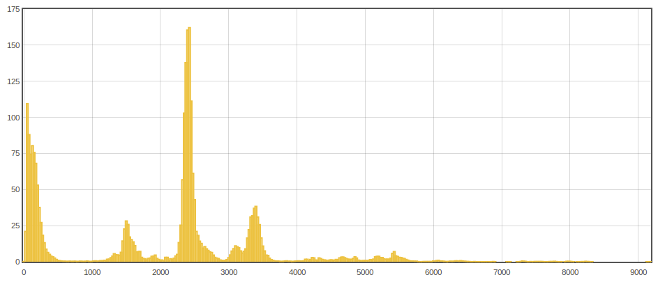 |
| Note: The histogram visualisation can be found under the Vis tab by selecting histgraph. The default histogram has smaller resolution bars at higher power levels, i need to add an option for higher detailed histogram data calculation in the input process model to make this easier to achieve. To produce the graph above I actual converted the power data feed to histogram data using a conversion module that can be found here. The code that produces the histogram as data is coming in can be found on lines 543 to 608 in the process_model.php. |
The histogram data can also be visualised within the kwh per day type graph so that we can see how a particular days energy consumption breaks down into energy used at less than say 1kw, energy used between 1 and 3 kW and 3kW up but then also easily compare one day to the next:
 |
| From the emoncms report module. |
For me, what I want to get out of monitoring my electricity consumption is to first understand how I use electricity and then work out what definite actions I can take to reduce any my electricity consumption and then be able to confirm that those actions did indeed produce the expected result. After all optimisations are done, Id like the monitor and reporting tools to help keep me informed that I am maintaining an optimum electricity use level overtime, that it does not creep up again.
To answer these questions directly I found I needed one other thing that goes hand in hand with the monitoring and visualisations above, I needed a rough model of my electricity consumption that breaks electricity consumption down on a per appliance basis. Any actions that we take are on an per appliance basis and so we really need a per appliance level of specificity. In the absence of per appliance monitoring or working applianceinference which would be the ultimate solution, this can be done with a simple model where a list of all the appliances in a house is entered manually including how many watts they use (which the energy monitor can be used to find out) and roughly how many hours per day they are used. This produces an estimate for how much electricity is used in a day, what the baseload should be and how much energy is consumed at different powers which can then be cross checked with the actual monitored data, the model can then be adjusted until the values align.
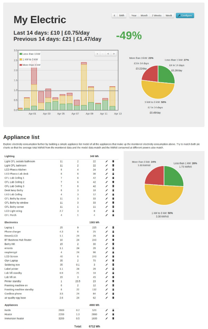
The reporting module in emoncms bring all this together on one page, the screen below shows the monitored data and model for the openenergymonitor lab and the small cottage next door:
 |
| You can find the reporting module in emoncms.org by clicking on Extras and then report. For local installations install the report module from github here |
To align the model to the monitored data its a matter of aligning the model pie chart to the monitored data pie chart. In our case electricity consumption is highly variable day to day, month to month so the model can only apply to either the average of the days in the selected view or a single particular day, its informative to adjust the model for different times of the year. Once the model aligns well, its then possible to experiment with changing the appliances in the model and how many hours they are used for to see what effect that might have on total daily consumption.
The conclusion of our electricity consumption investigation is that we could save 5-10% by changing all CFL's to LED's and turning standby items off at the plug (especially the hifi and soldering iron station), continuing to optimise kettle use and immersion heater is also super important as leaving a 2800W kettle on for an extra minute uses as much as a 6W LED left on for 7-8 hours and so can easily remove any savings achieved by turning lights off.
To significantly reduce electricity consumption further we would need to change the heating system and to take a whole house view: improve the building fabric performance by increasing insulation levels, reducing draughts and improving solar gain in order to reduce heating demand in the first place which is where recent work on temperature sensing, building energy modelling, the SAP calculator comes in but I will come back to that in further blog posts.
It would be nice to add additional tabs to the report module so that current and projected consumption levels can be easily compared, Id also like to add a feature to send a regular report email that keeps me updated on my week to week electricity consumption so that I can get at a glance information that minimises the effort I need to go to to see how I'm doing.
To engage in discussion regarding this post, please post on our Community Forum.