View your power data as a histogram in emoncms
This blog post details how to view your power data as a histogram in emoncms. This is a really useful feature implemented in emoncms by Paul Allen http://wattdata.blogspot.com (MarsFlyer on Gitub: https://github.com/MarsFlyer). So a really big thank you to Paul for this!
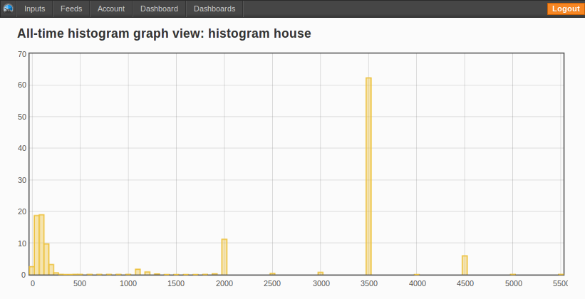
The histogram shows the energy (KWh) used at a particular power (watts) which allows analysis of what types of devices (low / medium / high) are using the most energy.
Here is the histogram visualisation for my house, embedded directly from emoncms.
Click on a particular day to see a histogram of that day:
Viewing your power data as a histogram
1) Send power data to emoncms see here for details of doing this with an emontx and emonbase: see Build a home electricity energy monitor

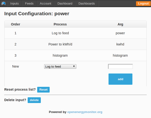
2) Click on the power input to bring up the input configuration page. Set up processes as in the screenshot, one power process, one kwhd process and one histogram process:
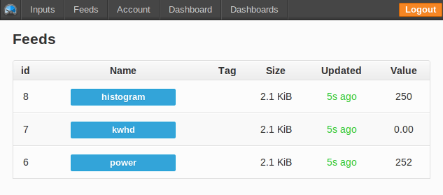
3) Click on Feeds to bring up the feed/list page, click on the histogram feed:
4) In the histograms feed/view page click on the graph type histogram:

5) Once you have been logging histogram data for a few hours you will start to see histogram bars form at the different levels of power that you use. This histogram graph shows energy used at a particular power for all time. So is a really useful tool for measuring what is the total energy used by the electric immersion water heater for example, we've used 62 kWh @ 3500W since April 13th.
6) To view your histogram data at a daily basis as in the first embedded visualisation above enter your feed id's and apikey in the following emoncms visualisation url:
http://vis.openenergymonitor.org/emoncms3/Vis/kwhd_histogram/kwhdzoomer.php?apikey=YOURAPIKEY&power=1&kwhd=2&whw=3
All the source code for the histogram functionality is available in the main emoncms3 repository on github http://github.com/openenergymonitor/emoncms3
Paul Allen has achieved some remarkable reductions in energy use over the last 4 years and uses a version of the histogram beautifully to visualise the changes, see his blog post here: Personal experiences of saving 42% on my electricity use