Getting visual
The Open Energy Monitor is all about getting visual. Using hardware to post collected data to emonCMS basically transforms the acquired data into easily understandable informations, and what's better than graphs.
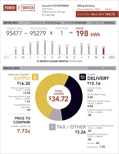
Here is a similar initiative that converts absurd electricity bills into meaningful information:
You can compare it with with the old bill:
It is obvious that presenting the same information in a different way makes a big difference. The redesigned bill is much easier to understand, and the use of shapes and colors turns something very abstract into tangible information.
But I believe that if we really want to democratize energy monitoring, we should take it one step further. We should offer people who have no idea what 4.2 kW or 150 kWh are, a reference to compare with. For example, visualizing 1kWh as the energy than ten 100W light bulbs consume in one hour makes it understandable to your grandma. Or showing one week's consumption each hour on one matrix using colored circles.
More important is to give a feeling of the order of magnitude. Like showing a community average VS your consumption on a colored scale to have an idea how well you're doing, lets you have a good reference point.
I agree that with households community averages are quite complicated since households have extremely different consumption patterns: some work from home, some have many guests, others spend very little time at home, etc... But when it comes to businesses, benchmarking is much less complicated, you can compare bakeries or cafes electricity consumption patterns in a much meaningful way.
I think this should be a main target to be implemented in emonCMS, and I believe that the community has something to say and contribute to this topic, so I started this forum thread : http://openenergymonitor.org/emon/node/715 please feel free to add your thoughts to it.
To engage in discussion regarding this post, please post on our Community Forum.
Here is a similar initiative that converts absurd electricity bills into meaningful information:
 |
| Source: FastCoDesign.com |
But I believe that if we really want to democratize energy monitoring, we should take it one step further. We should offer people who have no idea what 4.2 kW or 150 kWh are, a reference to compare with. For example, visualizing 1kWh as the energy than ten 100W light bulbs consume in one hour makes it understandable to your grandma. Or showing one week's consumption each hour on one matrix using colored circles.
More important is to give a feeling of the order of magnitude. Like showing a community average VS your consumption on a colored scale to have an idea how well you're doing, lets you have a good reference point.
I agree that with households community averages are quite complicated since households have extremely different consumption patterns: some work from home, some have many guests, others spend very little time at home, etc... But when it comes to businesses, benchmarking is much less complicated, you can compare bakeries or cafes electricity consumption patterns in a much meaningful way.
I think this should be a main target to be implemented in emonCMS, and I believe that the community has something to say and contribute to this topic, so I started this forum thread : http://openenergymonitor.org/emon/node/715 please feel free to add your thoughts to it.
